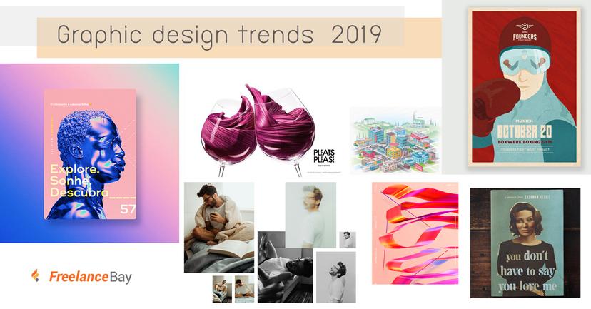


เนื่องจากปี 2018 กำลังจะหมดไปแล้ววันนี้แอดมีเทรนด์อัปเดตใหม่ของกราฟิกดีไซน์แห่งปี 2019 มาฝากเพื่อนๆทุกคนกันจ้า จะมีอะไรบ้างเลื่อนลงไปอ่านกันได้เล้ยย !!
1.3D design and typography
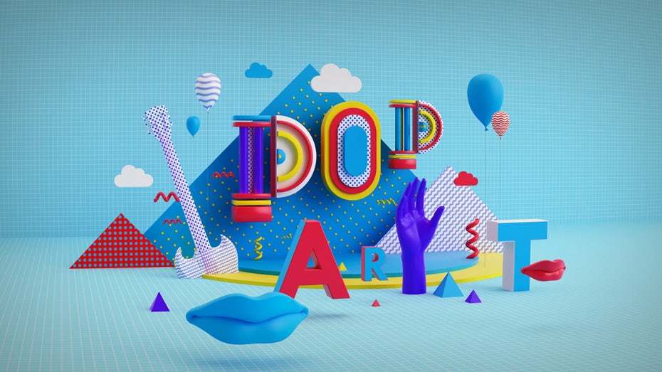
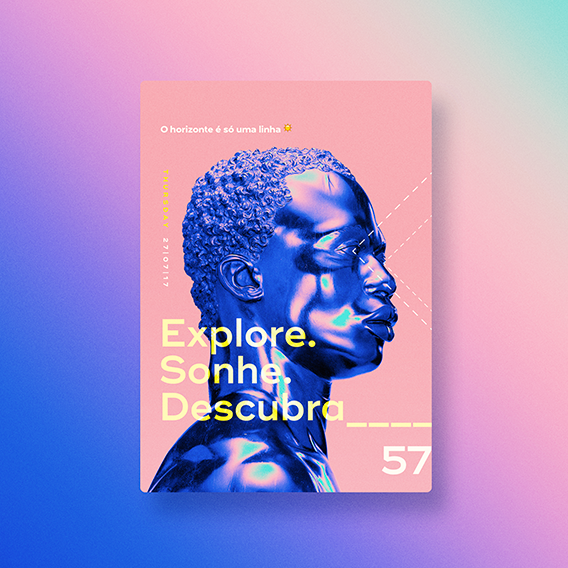
งานออกแบบสามมิติ หรือ 3D จะได้รับความนิยมอย่างมากขึ้นกว่าปีที่ผ่านมาส่วนที่ดีที่สุดของงาน 3D นั่นคือความไม่จำกัดขอบเขตรูปแบบของงานที่จะมาทำ ไม่ว่าจะเป็น bold, skinny, sans-serif, script, หรือฟอนต์ต่างๆ สามารถนำมาทำเป็นรูปแบบ 3D ได้ทั้งสิ้น รวมถึงการดีไซน์ typography แบบตัวอักษรต่างๆในรูปแบบสามมิติก็สามารถทำให้ผลงานของเราดูโดดเด่นและน่าจับตามองมากยิ่งขึ้น
A creative and fun metallic poster. By Pinch Studio.
These complex designs by Khatt Phatt offer something new for your eye every time you examine them.
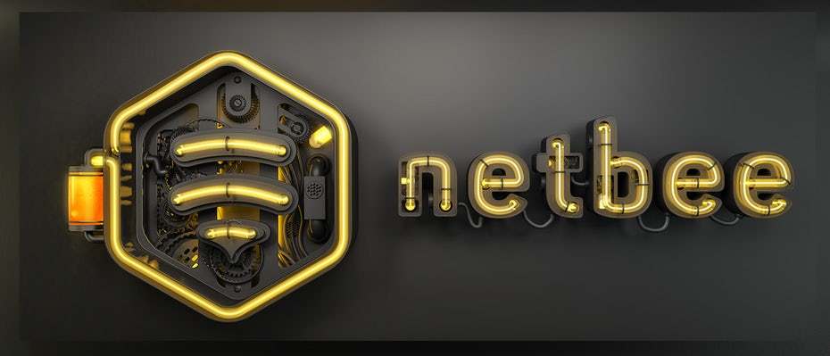
This composition shows how 3D design can enhance a logo design. Via Khatt Phatt.
A fantastic pop art composition. By Pinch Studio.
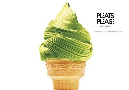
Incredibly rich textile textures. Via Isse Miyake.
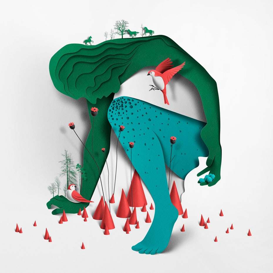
Papercut illustrations by Eiko Ojala manage to feel both futuristic and retro at the same time.
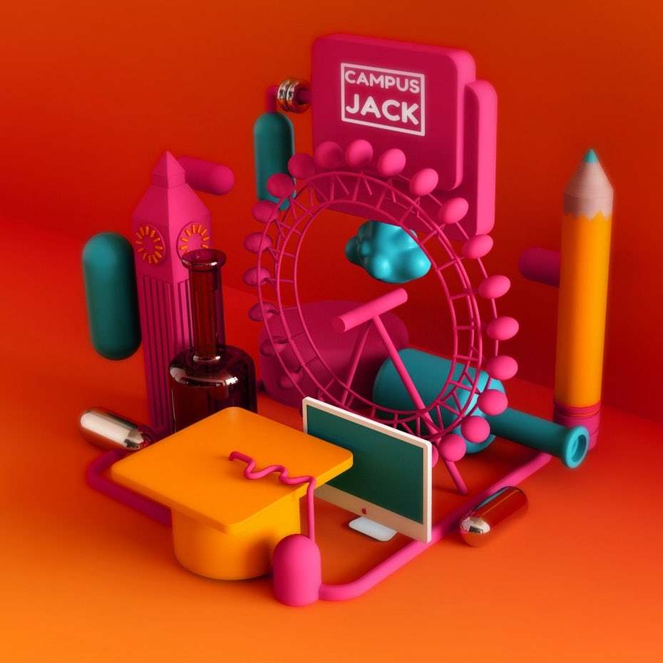
A fun, colorful 3D landscape by EFL.
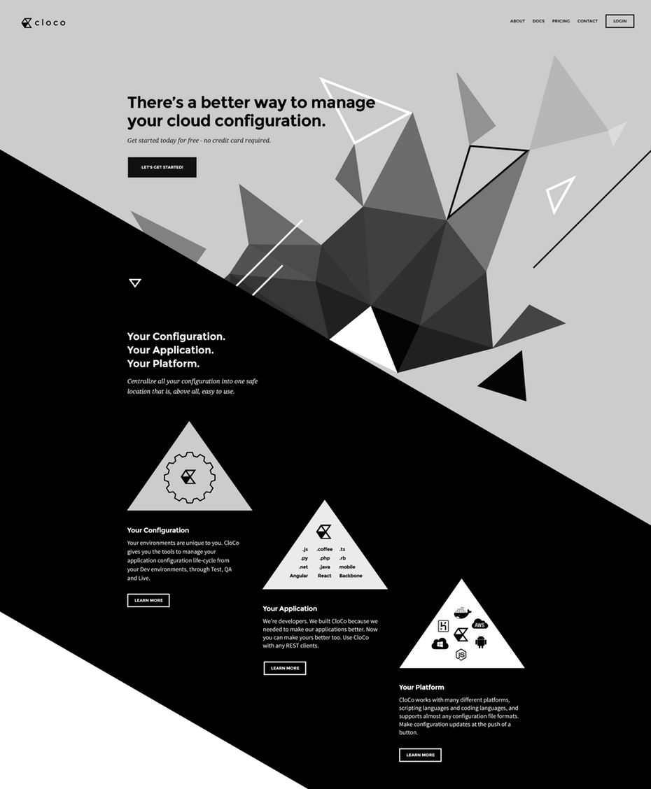
2.Asymmetrical layouts
การออกแบบโดยดีไซน์ออกมาอย่างไม่สมดุลย์ สมมาตร หลังจากที่เราต่างยึดอยู่แต่ในขอบเขตและกฎเกณฑ์ต่างๆ เหล่านักออกแบบเริ่มที่จะมองหารูปแบบการดีไซน์แบบใหม่เพื่อดึงดูดให้ผู้ใช้รู้สึกตื่นเต้นอยากรู้อยากเห็นความเป็นไปของข้อมูลและกราฟิกต่อๆไปในขณะที่เลื่อนอ่านหรือมองดู
Another asymmetrical layout challenges notions of the way products should be displayed. Via Artem Oberland.
The boxes in this design don’t interact the way we expect in a standard grid. Via Jesse Showalter.
This design avoids the normal grid display for artwork. By AbdooElhamdaoui.
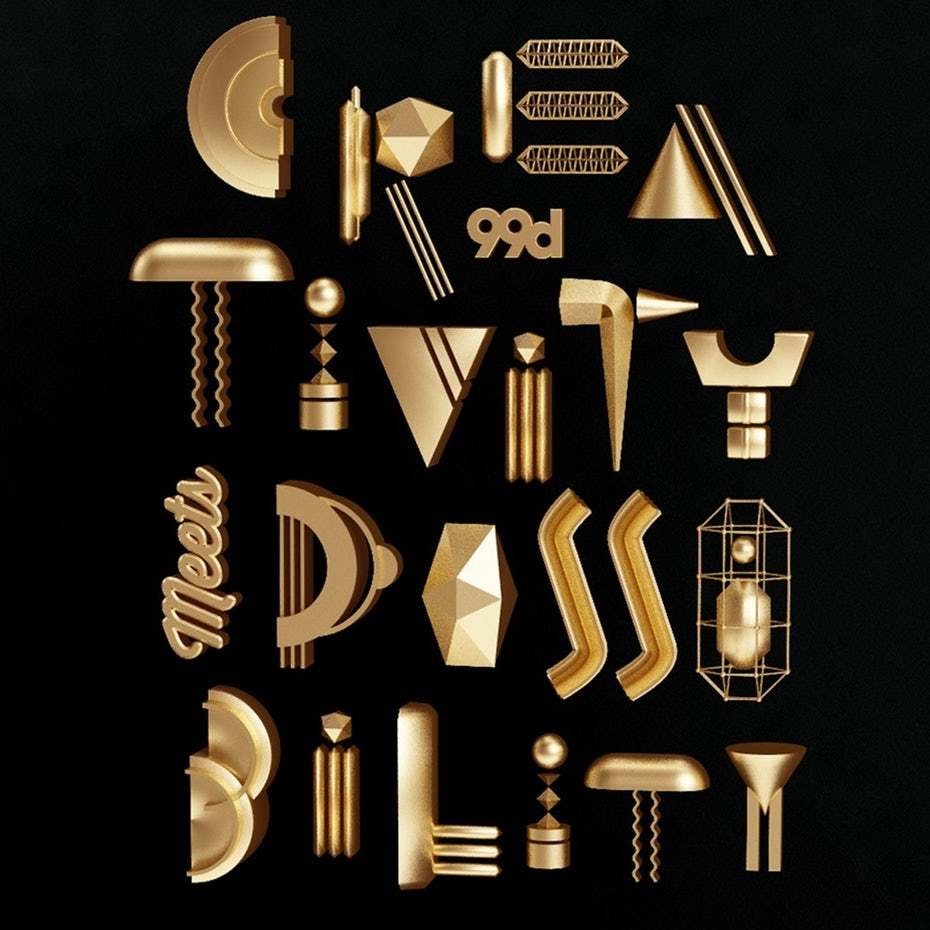
3.Art Deco
การออกแบบสไตล์อาร์ตเดโค (Art Deco) ได้รับความนิยมอย่างสูงช่วงปลายทศวรรษที่ 20 ทั้งในยุโรปและสหรัฐอเมริกาเป็นช่วงสมัยที่เรียกกันว่า Roaring Twenties และจะกลับมาอีกครั้งในปี 2019 โดยเฉพาะอย่างยิ่งในรูปแบบของการออกแบบดีไซน์โลโก้ (Logo)
" ลักษณะเด่นของงานออกแบบตกแต่งสไตล์อาร์ตเดโค (Art Deco) คือการใช้เส้นโค้งและเส้นตรงเรียบง่ายแต่แข็งแรง ลวดลายเส้นโค้งตามแบบรูปทรงธรรมชาติที่ตัดทอนมาจากศิลปะแบบอาร์ตนูโว รูปทรงเรขาคณิตเส้นสายโค้งมนสะอาดตา สีสันสดใส รูปทรงของเครื่องจักรกล "
(อ้างอิงจาก : อลังการสไตล์แห่งโลกอันไม่จีรัง อาร์ตเดโค)
(http://www.wurkon.com/full/researchs/artdeco/)
Another lovely metallic logo by Arthean.
Logo by aarif ™
Logo design by flycr.
This modern lion logo evokes the glamour and pomp of the Art Deco period. By Arthean.
Packaging design that uses fonts and motifs lifted directly from the Art Deco movement. By svart ink.
4.Modern Mid-Century Modern
หลังจากยุคการออกแบบสไตล์อาร์ตเดโค (Art Deco) แล้วเหล่านักออกแบบต่งก็แสวงหาการดีไซน์ในรูปแบบที่ฉูดฉาดและมีเส้นสายที่สะอาดสะอ้าน จึงเป็นที่มาของศิลปะการออกแบบสไตล์ Mid-Century Modern
-กระแสงานดีไซน์สไตล์โมเดิร์นจากหลากหลายแขนงที่เกิดขึ้นในช่วงกลางศตวรรษที่ 20 ได้รับอิทธิพลจากงานสไตล์ Bauhaus- (อ้างอิงจาก www.baanlaesuan.com)
Mid-Century Modern นั้นเป็นรูปแบบงานดีไซน์ที่มีรายละเอียดและมีรูปทรงที่อ่อนช้อย งานดีไซน์สไตล์นี้จึงมีรูปทรงเรขาคณิตที่ไม่มีความซับซ้อน และไม่มีการตกแต่งใดๆ ซึ่งเรามักจะเห็นการออกแบบสไตล์นี้กับภาพประกอบโฆษณาต่างๆ และในปี 2019 คาดว่าจะเห็นงานออกแบบสไตล์ ทั้งทางเว็บและงานพิมพ์อยู่เรื่อย ๆค่ะ

Poster and ad design came to define Mid-Mod period. Via ANAMOLLY.
This illustration style pulls heavily from the mid-century aesthetic and will be everywhere in the coming year. By Spoon Lancer.
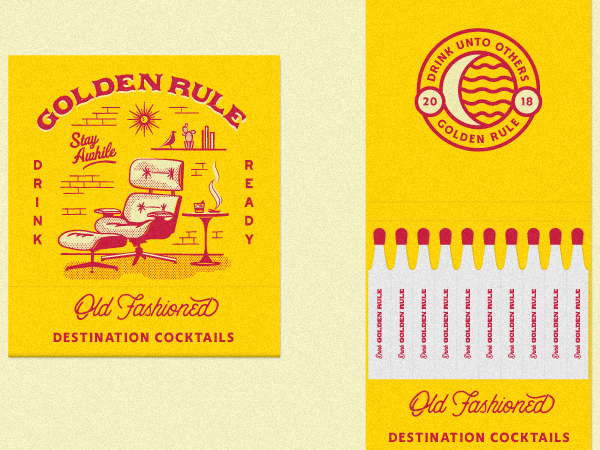
A matchbook design that draws on the classic “Atomic” styling popularized in the Cold War period. Via Nicola Broderick.
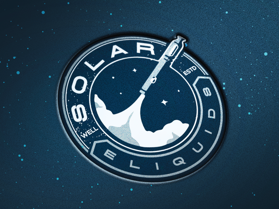
Another Space Race inspired design. By Arthean.
Patterns that evoke the masters Mid-Century modern graphic design. Via Andrew Littmann.
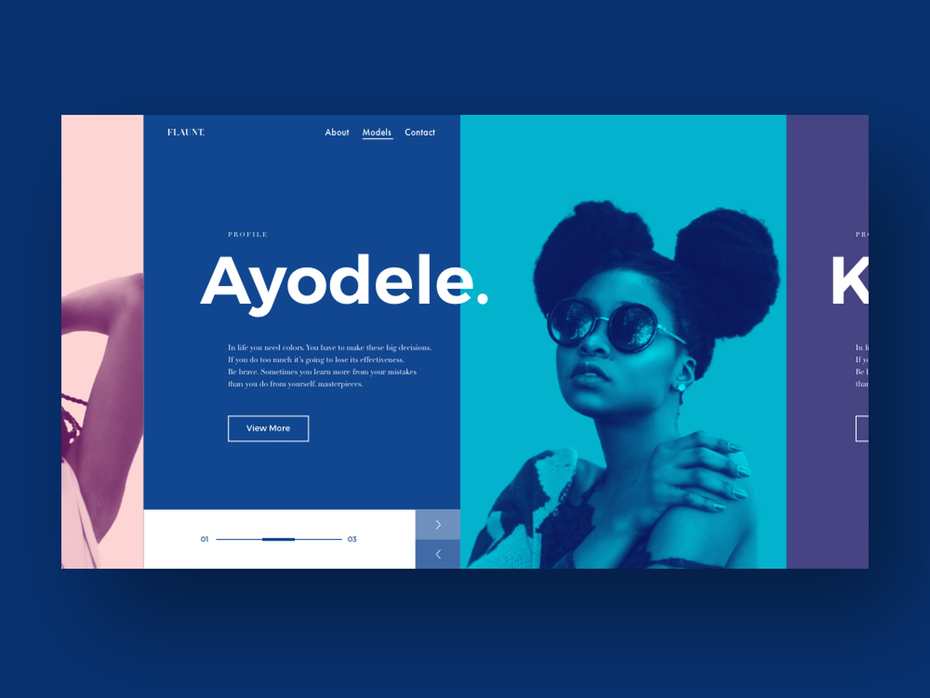
5.The continuing evolution of duotones and gradients
Gradients หรือการไล่ระดับสีเป็นอีก 1 ดีไซน์ที่ได้รับความนิยมในปีที่ผ่านมาจากเดิมที่ในการออกแบบโลโก้นั้นใช้เพียงแค่สีเดียวก็ได้ปรับพัฒนาเป็นการใช้ gradients แทนที่ อีก 1 รูปแบบงานดีไซน์ที่เป็นที่นิยมอย่างมากในช่วงปี 2018 คือ duotone ที่เป็นการนำเฉดสีเพียง 2 สีมาใช้งาน ตัวอย่างที่เห็นชัดเจนคือรูป cover ปก playlist ของ Spotify
จากที่กล่าวมาข้างต้นทำให้รูปแบบดีไซน์ของปี 2019 จะมาพร้อมกับดีไซน์ในรูปแบบ duotone gradient ที่ผสมผสานระหว่างทั้ง 2 รูปแบบ และการใช้อย่างใดอย่างหนึ่งเอาไว้ด้วยกันค่ะ
artsigma offers two nice gradient logos in the classic “blurple” duotone.
This shows how bright (but complimentary) gradients can be used throughout a web design. By mikebarnes.
This gorgeous combination of bold gradients is the definition of on-trend. Via Bruno Pego.
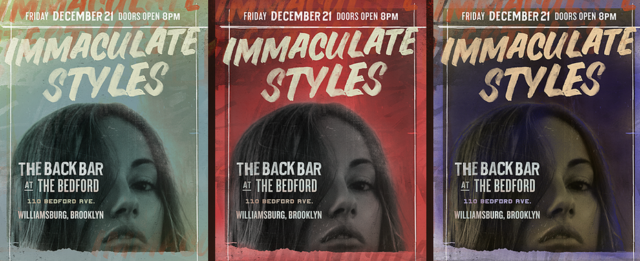
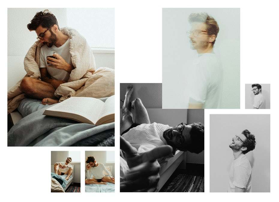
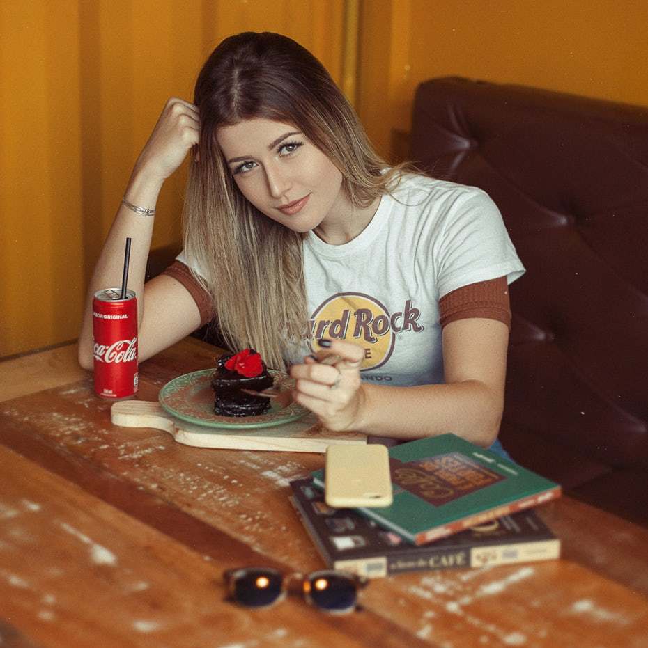
6.But also a steady rise for warm and moody color palettes for photos
นอกจากการใช้ duotone gradient กันอย่างแพร่หลายแล้วการใช้โทนสีอบอุ่นที่สามารถเล่นอามรณ์ความรู้สึกก็เป็นอีกรูปแบบหนึ่งของงานดีไซน์ในปี 2019 ค่ะ
A fashion spread that ditches the usual bold colors in favor of muted tones. Via lasho.
Contemporary portraits that feel like they were lifted from a 1970s photo album. Via Fernando Machado.
Stunning collage-inspired book cover and mixtape cover by nevergohungry
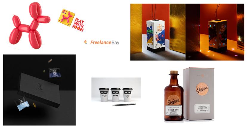
7.Custom illustrations lighten up
จากการออกแบบที่ใช้ลายเส้นหนาและแข็งแรงจะกลับมาเปลี่ยนเป็นการใช้ลายเส้นแบบที่มีความละเอียดอ่อนมากขึ้นอาจมีลูกเล่นของการทับซ้อนกราฟิกทั้งนี้ได้รับอิทธิพลมาจากผลิตภัณฑ์ธรรมชาติต่างๆ การออกแบบรูปแบบนี้จะทำให้มีความเป็น feminine และสามารถดึงดูดความสนใจจากลูกค้าได้อย่างมากขึ้นโดยเฉพาะอย่างยิ่งในด้านการออกแบบบรรจุภัณฑ์ค่ะ
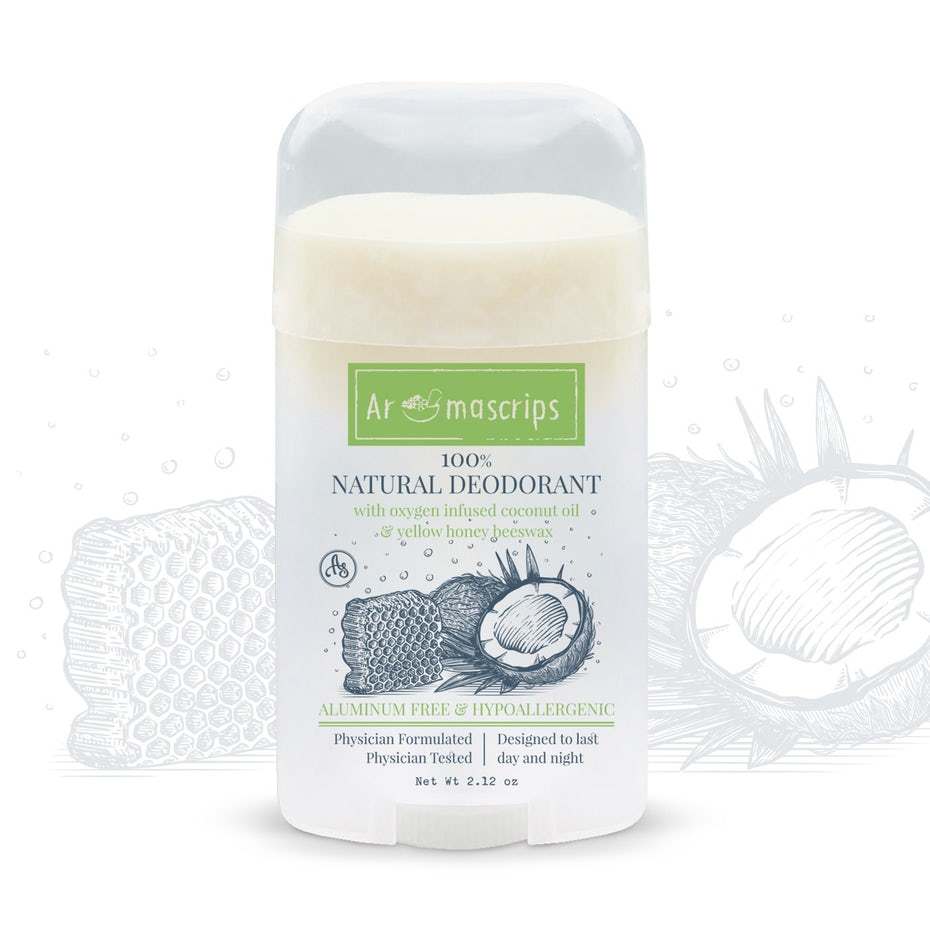
Lighter, more organic packaging design for a natural deodorant company. By Wooden Horse.
A playful branding design by Gwydion”
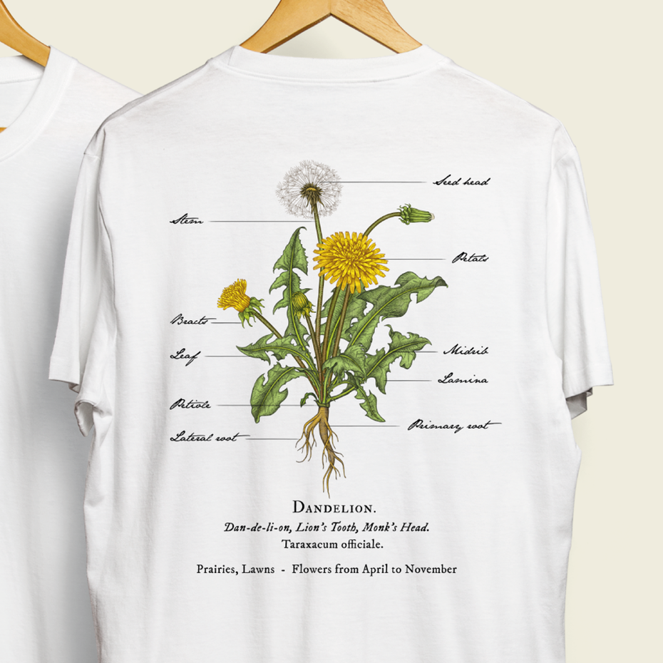
A soft illustration inspired by old botanical drawings. By Yokaona.
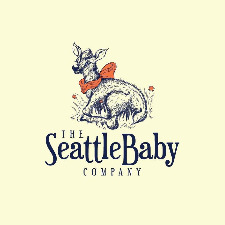
This adorable deer created for a baby accessory brand. By Mad Pepper.
8.Buxom serifs
เมื่อเราปรับระดับการดีไซน์ภาพประกอบให้มีความสว่างหรือโปร่งมากขึ้น ดังนั้นการใช้ฟอนต์หรือตัวอักษรจึงจะต้องหนักแน่นหรือแข็งแรงมากขึ้นจึงเป็นที่มาของฟอนต์ serifs สำหรับเทรนด์การออกแบบในปี 2019 จะกลับมาได้รับความนิยมมากขึ้น
" เซริฟ (serifs) คือแบบอักษรที่มีขีดเล็ก ๆ อยู่ที่ปลายอักษรเรียกว่า เซริฟ ดังที่ปรากฏในตัวอักษรตระกูล Times แบบอักษรชนิดนี้มีชื่อเรียกอีกอย่างหนึ่งว่าแบบโรมัน (roman) ซึ่งมีต้นกำเนิดมาจากอักษรที่จารึกไว้ในหินของอาณาจักรโรมัน เซริฟมีส่วนช่วยในการกวาดสายตาไปตามตัวอักษร ทำให้อ่านง่าย และนิยมใช้สำหรับพิมพ์เนื้อความ
ซานส์เซริฟ (sans-serifs) มีความหมายตรงข้ามกันคือไม่มีขีดที่ปลายอักษร และมีชื่อเรียกอีกอย่างว่าแบบกอทิก (gothic) อักษรชนิดนี้ไม่เหมาะกับการเป็นเนื้อความ แต่เหมาะสำหรับใช้พาดหัวหรือหัวเรื่องที่เป็นจุดเด่นซึ่งมองเพียงครั้งเดียว อย่างไรก็ตาม ฟอนต์สมัยใหม่ที่ได้รับการออกแบบในคอมพิวเตอร์ อาจมีทั้งแบบเซริฟและซานส์เซริฟปะปนกันในฟอนต์หนึ่งๆ "
(อ้างอิงจาก : ข้อแตกต่างระหว่างฟอนต์ Serifs กับ Sans Serifs)
(https://www.marketingoops.com/reports/infographic-reports/infographic-serifs-vs-sans/)

The beautiful and classic serif feels bespoke and hand-carved in this logo for a high-end construction company. By Dave Roach.
Lighter illustration and trendy serifs combine on this restaurant logo. Via tulimilka.
A website template that evokes ultra-minimalist/Scandinavian design. By Alex Capellan.
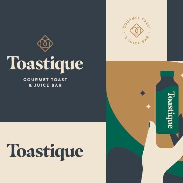
Branding for a toast and juice bar. Via Levi Lowell.
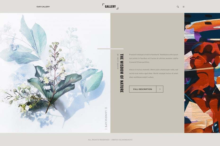
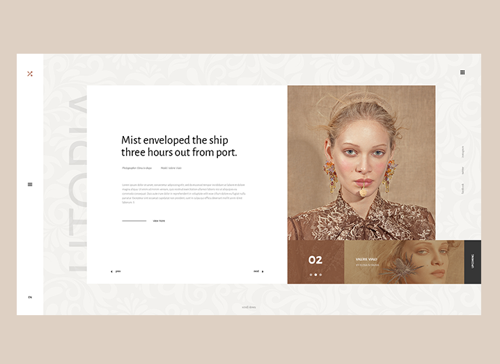
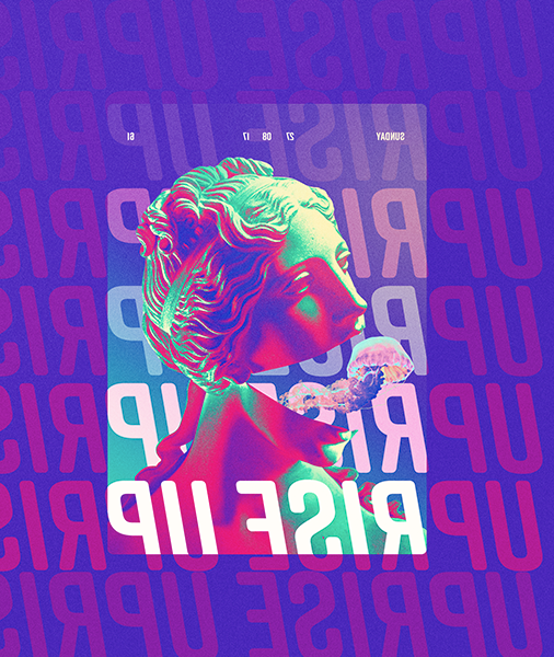
9.Open compositions
การเปิดรับความคิดเห็นและจินตนาการต่างๆเริ่มมีมากขึ้นไม่ได้ปิดกั้นอยู่ในกฎเกณฑ์แบบเดิมอีกต่อไปทำให้เหล่านักออกแบบมีอิสระในความคิดและการดีไซน์รูปแบบงานต่างๆ องค์ประกอบเหล่ารวมถึงการใช้พื้นที่สีขาวและหลีกเลี่ยงกฎเกณฑ์ต่างๆที่ชัดเจนทำให้มีความโดดเด่น แปลกตาและดึงดูดมากยิ่งขึ้น

This design hits the mark for 2019 with duotones, gradients and an open composition style. Via Bruno Pego.
A bold and open design that makes you wonder if you’re holding it right side up. Via Vasjen Katro.
Light, modern illustrations that feel like they are continuing off-screen. Via Lionel Durimel.
A open composition used for a modeling website. Via Kieran.
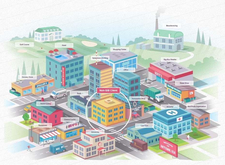
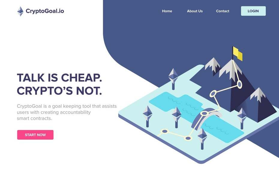
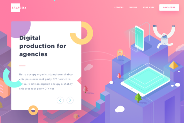
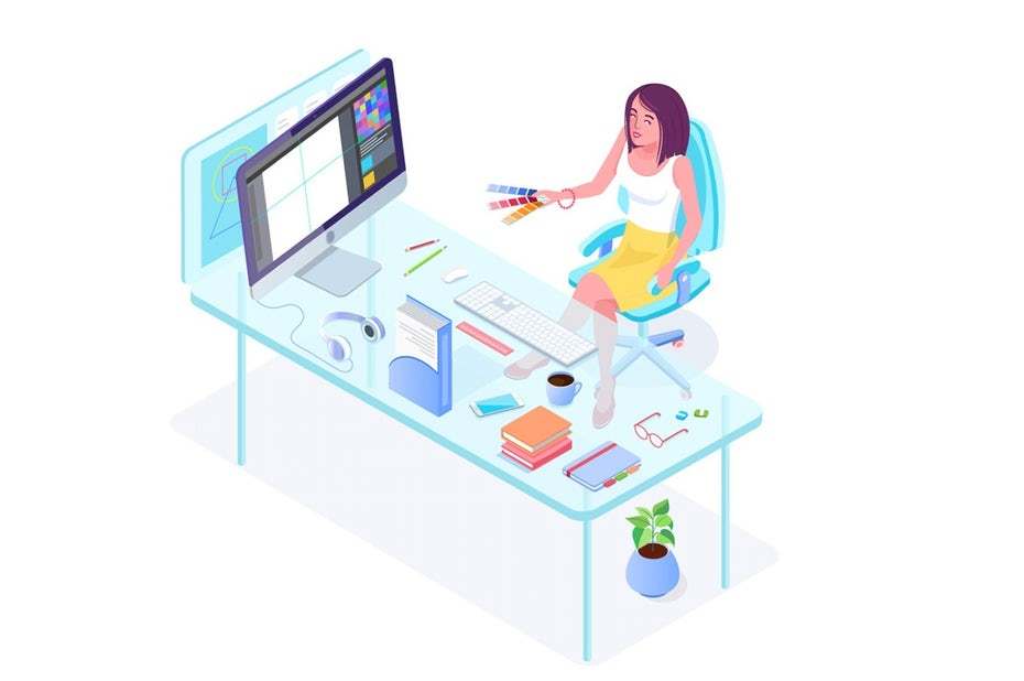
10.Isometric design
การออกแบบแบบไอโซเมตริก (Isometric) เป็นการออกแบบสามมิติบนสองมิติ (drawing a 3D object in two dimensions.) รูปแบบนั้นดูเรียบง่ายและสะอาดตา สำหรับงานที่มีการแข่งขันในการออกแบบลักษณะดังกล่าวมากที่สุดคือการออกแบบ icons ต่างๆค่ะ
" ภาพไอโซเมตริกจึงเป็นภาพ 3 มิติที่เขียนง่าย ที่มีมุมเอียงและสัดส่วนแน่นอน ภาพไอโซเมตริกนี้จะแสดงให้เห็นถึงด้านหน้า ด้านข้าง และด้านบน โดยที่ขอบงานจะตั้งตรงขึ้นในแนวดิ่ง และชิ้นงานจะถูกสมมติให้วางเอียงไปด้านหน้าประมาณ 35 องศา 16 ลิปดา ซึ่งจะได้ภาพด้านข้างเอียงทำมุม 30 องศา กับแนวระดับเท่ากันทั้งสองด้าน "
(อ้างอิงจาก : ภาพสามมิติ https://sites.google.com/site/chaowpreeya/home/6-phaph-sam-miti)
A very on-trend isometric mountain. By KisaDesign.
A super fun isometric landing page. Via Ghani Pradita.
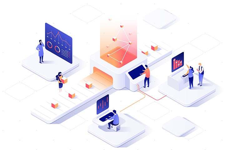
This design shows data moving in a way that feels more vibrant and alive than flat design. Via Dmitrii Kharchenko.
Isometric design can be used for character creation, as well. By Daria V.